Building Systems Explorer
BuroHappold Engineering is an international multi-disciplinary engineering firm that works with premier contractors and architecture firms to make ambitious building plans a reality. While working with the Sustainability Team at BuroHappold’s New York City offices in summer 2014, I spearheaded several initiatives to bring data-driven approaches to the company’s workflow.
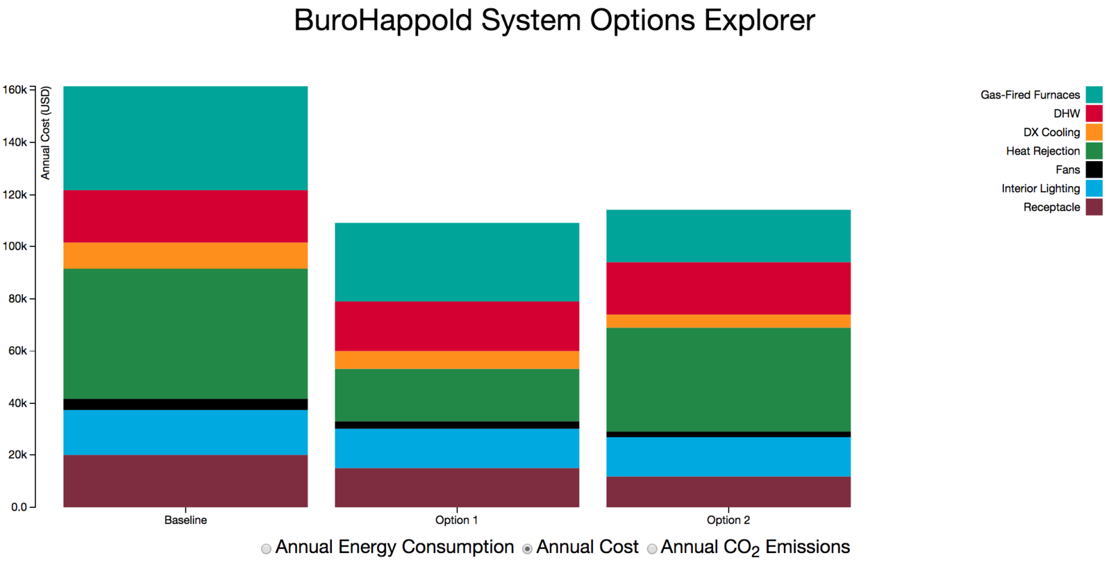
One such project was this building systems explorer. Clients often have difficulty understanding how mechanical system options compare to one another, and for good reason. The relationships between systems can be complex. For example, one system with a smaller water heater may reduce gas use but increase electricity use compared to a system with a larger water heater. These two systems may perform similarly in terms of overall energy efficiency, but depending on local gas and electricity prices, one may be less expensive. How do the energy usages of the two water heaters compare? How does each contribute, in relative terms, to the rest of the system they are in? This tool is designed to allow users to explore these complicated interrelationships.
How it works
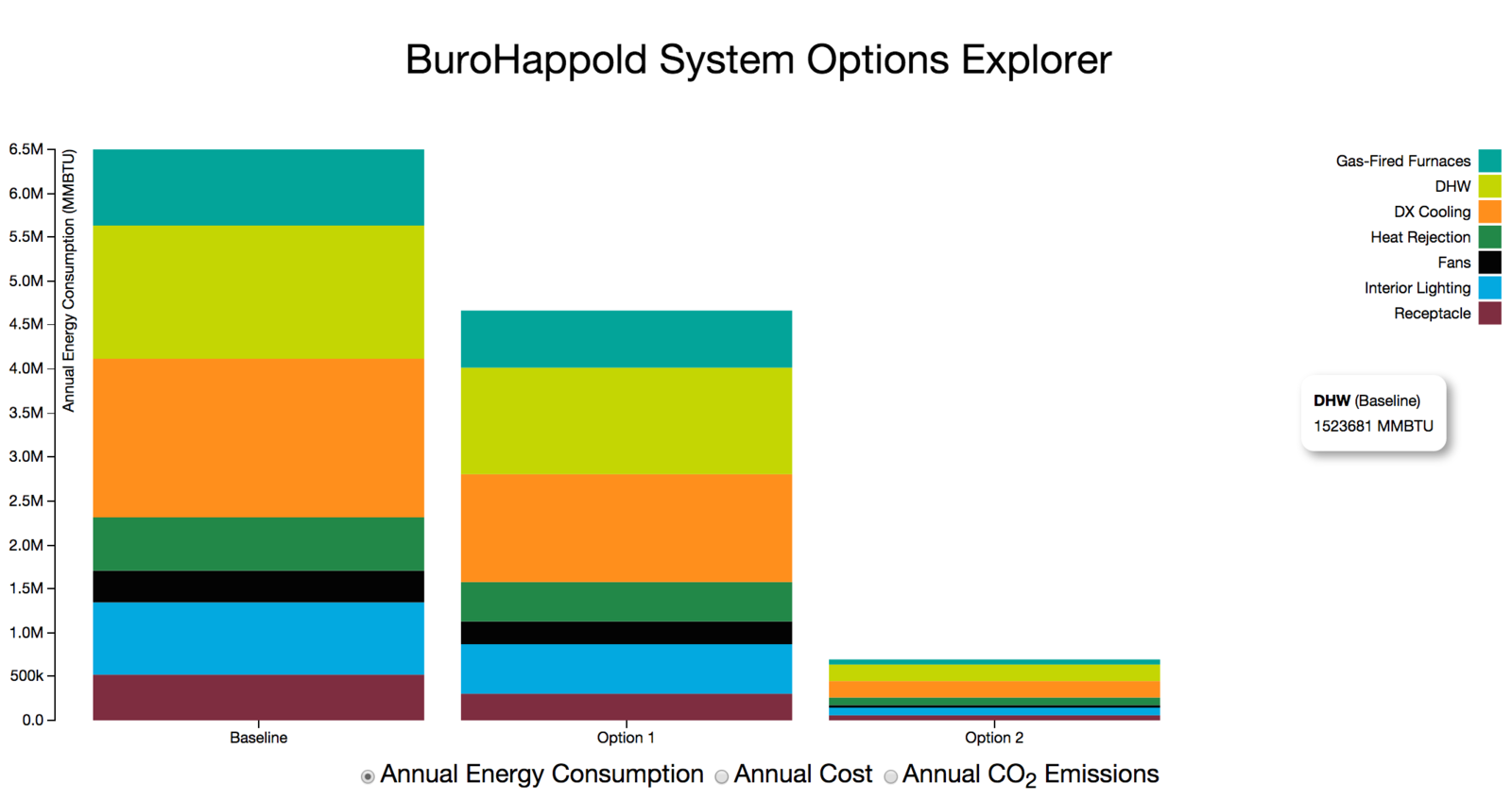
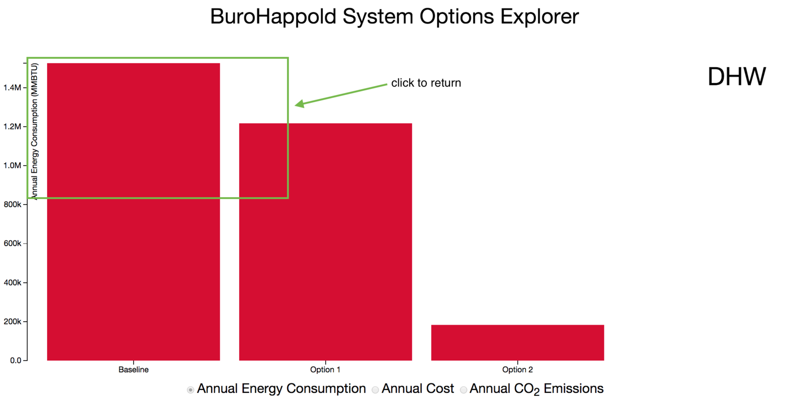
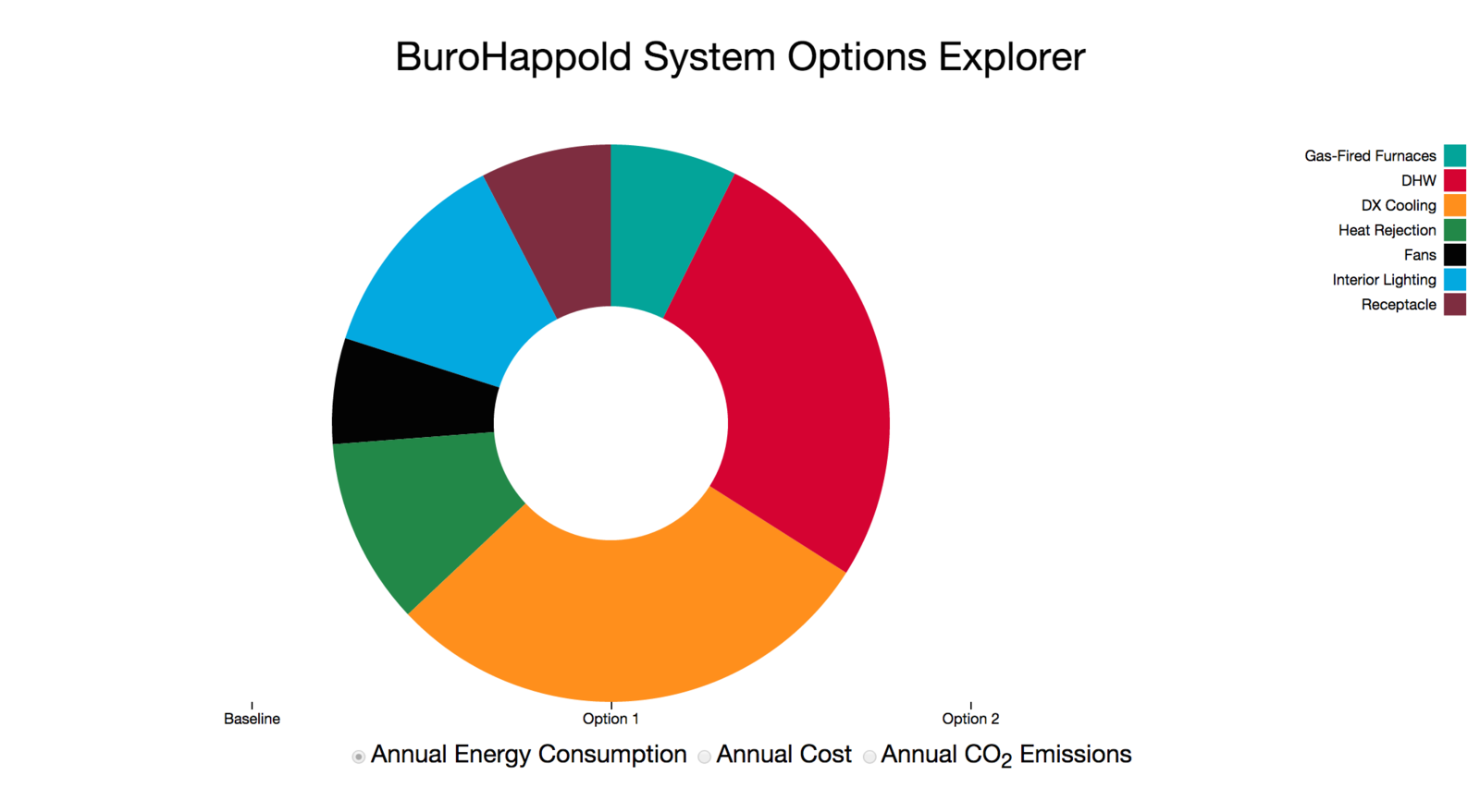
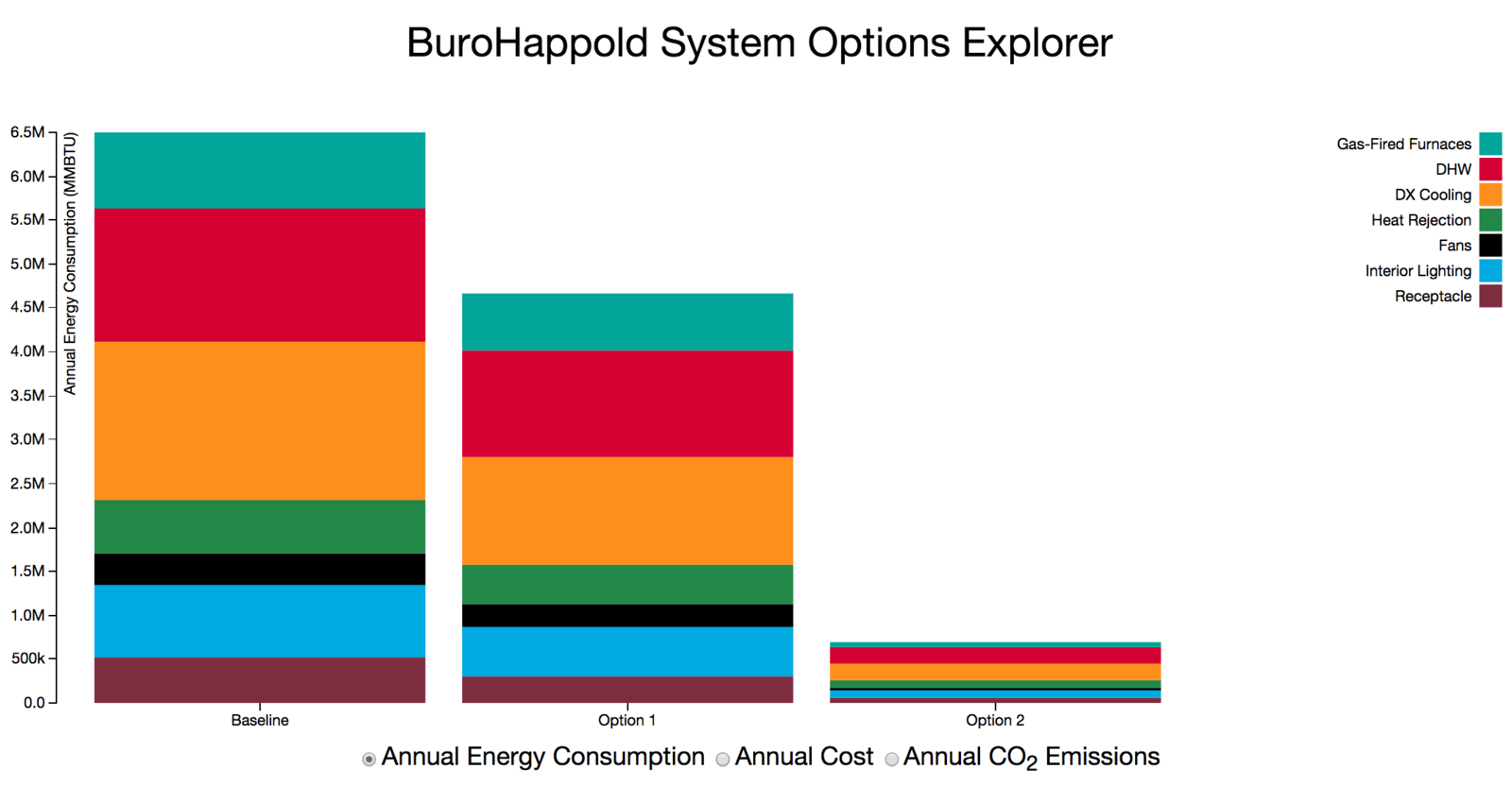
The home screen is a stacked bar chart comparing three system options. Hovering over a rectangle highlights the rectangles of the same category in the other systems (and the legend), and generates an information bubble giving more specific information about that part of the system. Clicking on a rectangle isolates that category in each of the systems and allows users to compare the usage for that system across the system options. Clicking in the upper left-hand corner returns the user to the main screen. Clicking on any of the entries in the x-axis allows the user to explore the energy use makeup of that option. Clicking on the x-axis again returns the user to the home screen. Finally, the user can switch between different metrics for building performance by clicking on the radio buttons on the bottom.
Note that this is a prototype; some particular design decisions, such as how the user should return to the stacked bar chart, were not addressed in any significant way. In the donut chart, we intended to provide a marker for which system was currently being explored, but did not have time. Additionally, the blinding green color was not a design choice, but rather a response to an updated visual identity at BuroHappold. This was the first visualization I worked on using D3.
Example
Hovering over a rectangle highlights the same system in different options (along with the appropriate box in the legend).
Clicking a rectangle isolates that subsystem across the different options.
Clicking the upper left corner of the screen returns the user to the home screen. Clicking on an entry on the x-axis allows the user to isolate one option.
Clicking on the x-axis again returns the user to the home screen.
All of these options are also available after changing the metric selection (radio buttons on bottom).
Why it matters
This tool is an example of interactive design that allows the user to explore complex information. The complexity of the data required an approach that emphasizes comparison in different ways.
Technologies
- Javascript + d3.js
- HTML
- CSS