Building Benchmarker
BuroHappold Engineering is an international multi-disciplinary engineering firm that works with premier contractors and architecture firms to make ambitious building plans a reality. While working with the Sustainability Team at BuroHappold’s New York City offices in summer 2014, I spearheaded several initiatives to bring data-driven approaches to the company’s workflow.
One such project was this benchmarking web application. A common question for clients is how projected building efficiency would compare to similar buildings around the country. Though efficiency data for buildings are increasingly made available through government agencies, no engineering firm had made a systematic effort to utilize these data in the service of informing clients. My task was to prototype a system for doing so.
How it works
Two sources of data for nationwide energy efficiency information are the Department of Energy’s Building Performance Database, which utilizes a REST API to distribute aggregate data about building performance, and the U.S. Energy Information Agency’s Commercial Buildings Energy Consumption Database, which is a survey of building performance data collected every four years by the Agency and distributed as disaggregated CSV files on its website.
I first built flexible software tools that allow the Sustainability Team to access the relevant data from each of the two databases easily, filtering by specific building use categories and size parameters. Another program sits between the two data collection tools and smashes their outputs together by standardizing the units, computing quantiles and writing both sets of data to a CSV. The final step was to build a simple visualization of the combined data, which computes the percentile for different system options and makes it available to the user by hovering over the appropriate model’s marker.
Note that the design requires BuroHappold to benchmark the system and create files before users receive their customized graphic. This was a conscious design decision requested by BuroHappold to allow them to choose appropriate comparison buildings and provide information on the different system options they are presenting.
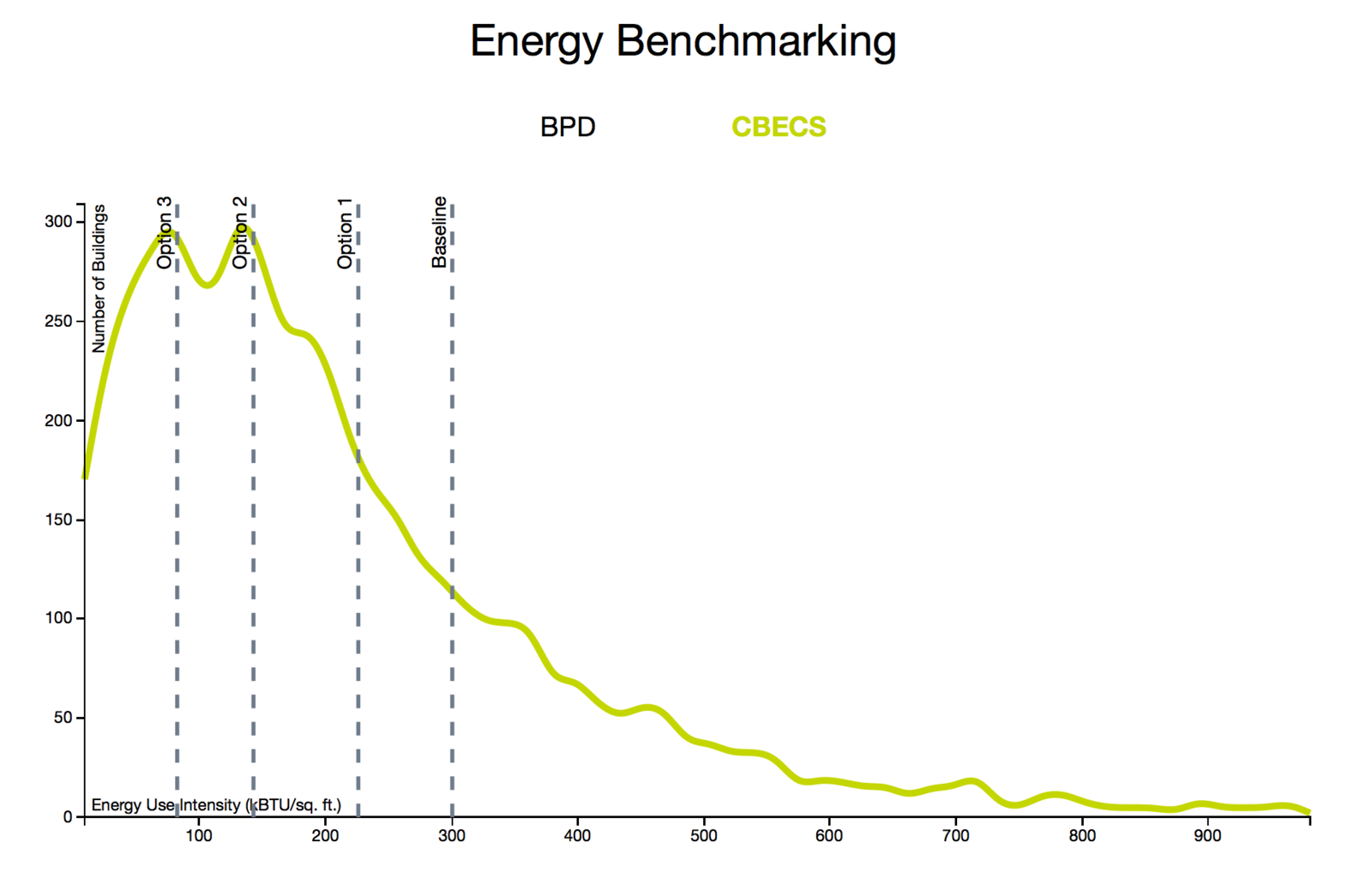
After review with the team, we decided that in the interest of object permanence and offering the most flexible experience for users, the distributions of buildings from both data sources should be separate lines and should be viewable simultaneously. Because it is a prototype, the experience is not as polished as a final product might be.
Example
Please note, the blinding green used for the line was to conform to newly adopted visual standards at BuroHappold while I was there. It is not necessarily the ideal color choice.
When users visit the page, they are presented with the distribution of buildings for different levels of Energy Use Intensity from the Building Performance Database.
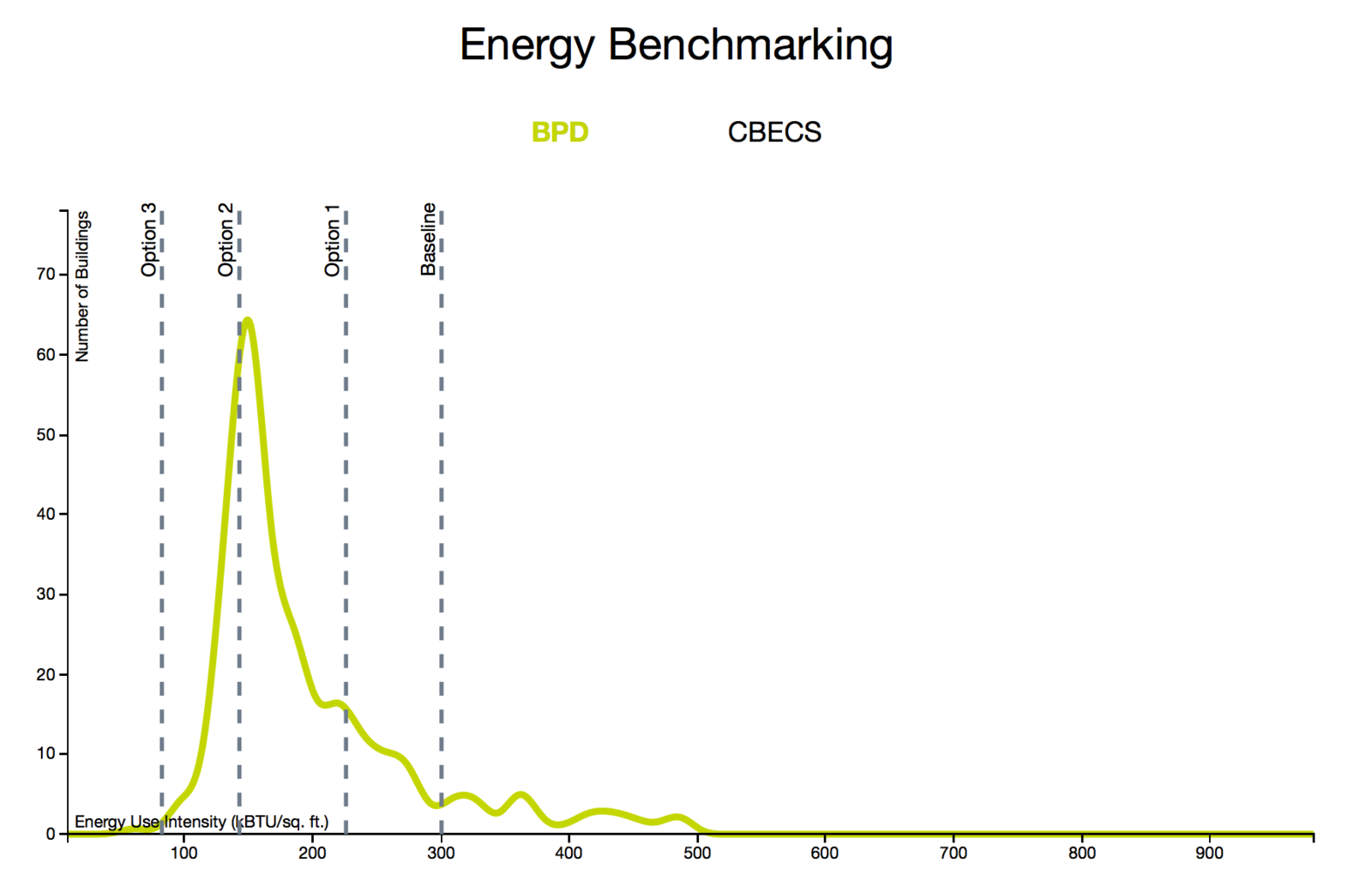
Vertical lines locate the proposed system configurations in the distribution. Hovering over the lines or names reveals more specific information on the system configuration.
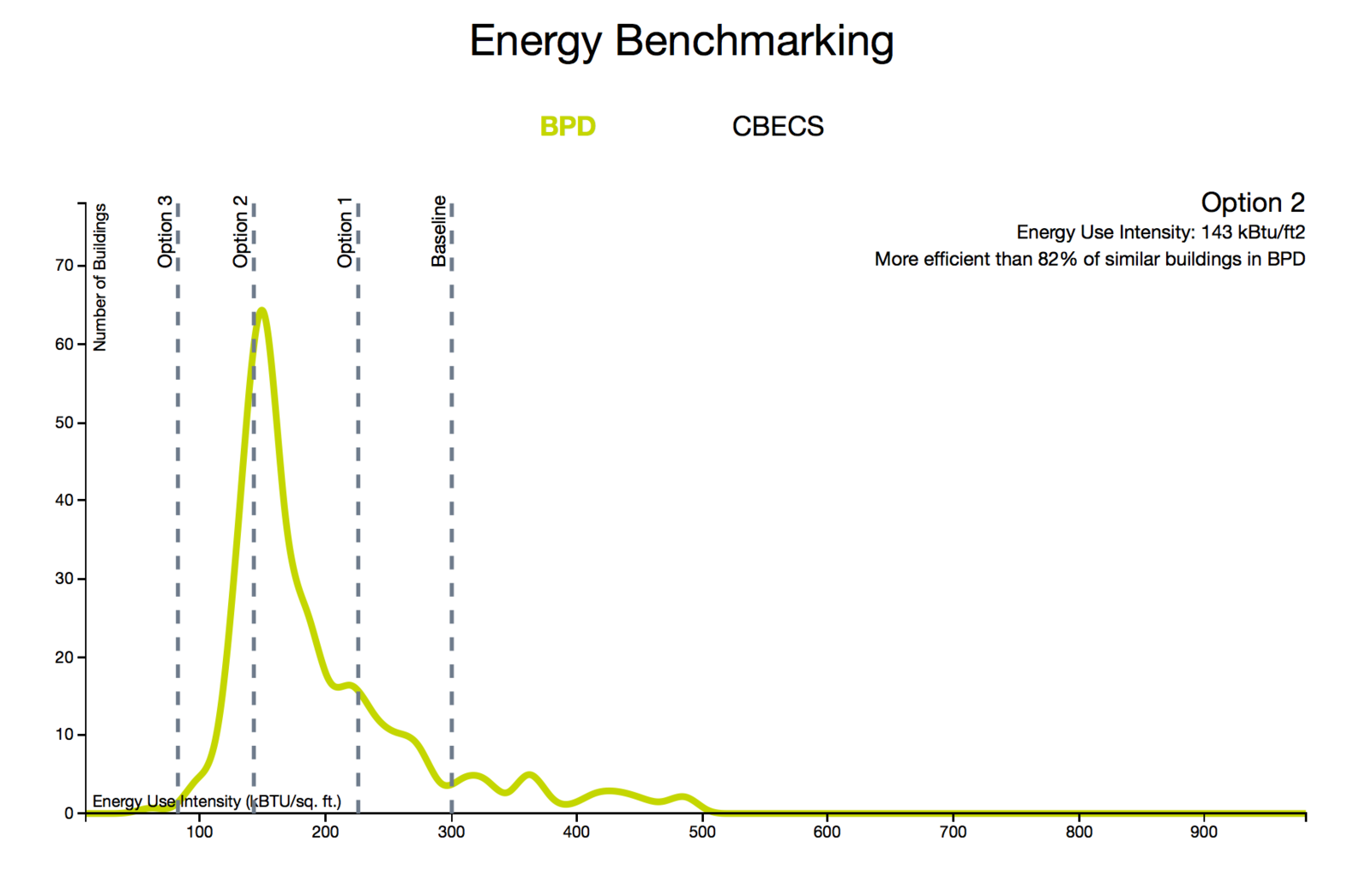
Clicking on “CBECS” will switch to the other dataset, which has the same features.
Why it matters
This tool is an example of interactive design fed by a rich analysis and design for reusability. Though the collection and analysis of the data are somewhat complex tasks, the user does not see that complexity. By building the graphic on top of reusable and easy-to-use data collection programs, this single project created several different tools that can be applied to other visualizations or analyses.
Technologies
- Python
- Javascript + D3
- HTML
- CSS